Telling Stories of Transitions
Mariah A. Knowles
Sun, Feb 14, 2021
Update: A conference paper and presentation are now available, based on this post
Update-update: A conference workshop is now also available, based on the same data as this post but using cleaner methods
Last May I started an 80 hour research practicum with the Epistemic Analytics Lab, which develops tools and methods for Quantitative Ethnography. And a year ago today I started hormone replacement therapy.
Like many transwomen, I keep notes on my experiences. These "field notes" serve many purposes. They are our way of tracking changes that happen so slowly they can only be seen in retrospect. They are our way of processing events, memories, and thoughts. And they are our way of reflecting on (and practicing conceptualizing) our identities.
And like many graduate students who are procrastinating from her main area of dissertation study (AI Ethics Education), I coded and analyzed my daily notes using the methods I was learning in my practicum.
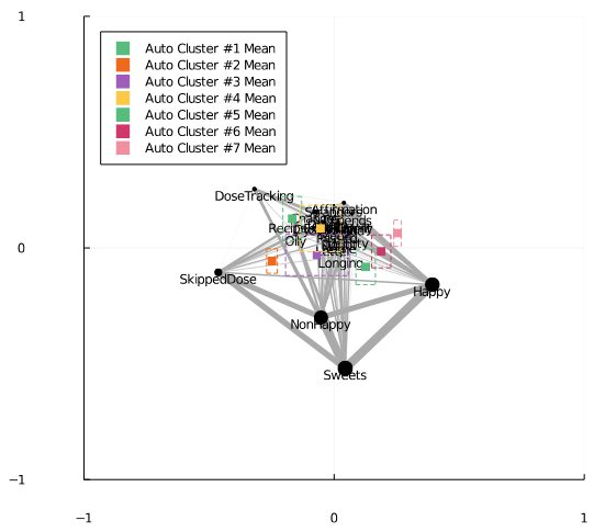
The result (Figure 1) reflects how, early in my transition, I was skipping doses some days and keeping to the minute notes about when I was taking them, vs. how, more recently, I've been measurably happier.
This is accurate.
This is affirming as hell.
But this is not all that insightful.
Linear models of high dimensional spaces (like ENA, LDA, and PCA) work by constructing axes through the spaces that researchers then have to interpret. The problem with axes is that they don't provide much detail when continuous variables (like time) are the variables we want to tell our story along. They reduce the story to two points: the beginning and the end.
But stories of transitions are not stories of beginnings and ends. They are messy and they are lumpy.
What I needed was a non-linear way to model the qualitative story.
And so, building on my Trans Math Day presentation, here's what I tried.
Linear projections retain global information at the sacrifice of local information. In Figure 1, the x-axis shows the dimension that best discriminates the data over time. This gives us big picture distinctions, the before and the after. But the "clumps" of similar data in the journey along the way, that is lost.
Nonlinear projections are the counterpart. They sacrifice global information in favor of local information. They can represent neighborhoods of similar points, they can begin to show us structures in the high dimensional data, and good ones can suggest overall axes. But, one has to be careful not to read too much into the big picture distinctions in nonlinear plots.
UMAP is a decent nonlinear projection technique. Figure 2 shows the result of running UMAP on the same data that's shown in Figure 1. Notice that, without knowing anything about time, the projection uncovers the temporal structure of the data: red tends to be on the right, and blue tends to be on the left. So, reverse of Figure 1, time appears to move from right to left.
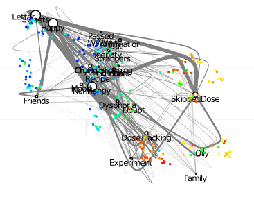
What Figure 2 also shows us are clumps of similar days. There were days when I was trying new things and figuring this whole "transition thing" out (DoseTracking + Experimenting). There were days when I was doubting and feeling awful about myself (Dysphoria + Doubt). There are days when I wrote reflections on experiences that had happened out in public (Strangers + Identity + Passed). And, of course, lately I've been feeling great and hanging out with my friends, whom I'm out to (Happy + Friends).
But just clumping together similar days doesn't help me show a story that moves over time. Temporal stories are not steady linear progressions (Figure 1) or a disconnected typology of events (Figure 2). There are also structural breaks, key moments that, fundamentally, changed how I felt and was processing things.
The UMAP implementation in Julia, which is the language I was writing my ENA code in during my practicum, allows for user-defined metrics. A metric is a measure of how different two points in time were. There were 365 days between 2020-02-14 and 2021-02-13, for example. So, 365 is one metric. Another metric is the Euclidean distances between two days as represented by their high dimensional networks. Days where the exact same set of codes co-occured would have a distance of zero, for example.
So, I combined these two kinds of metrics together, appending the time variable to the high dimensional network data. I then created a weighted Euclidean metric with one parameter, w1. When w1=0%, distance is calculated entirely from distances in the network space, and we get Figure 2. When w1=50%, half of the calculation is done with differences in time, and the other half is done with network distances. And when w1=100%, distance is calculated entirely from differences in time.
When w1 is low, we tend to see clustering based on similarity between networks. When w1 is high, we tend to see the "timeline" structure of the data, as shown in Figure 3. But, because there is still some effect of the network differences in the model, the projection also tends to show structural breaks in the story over time.
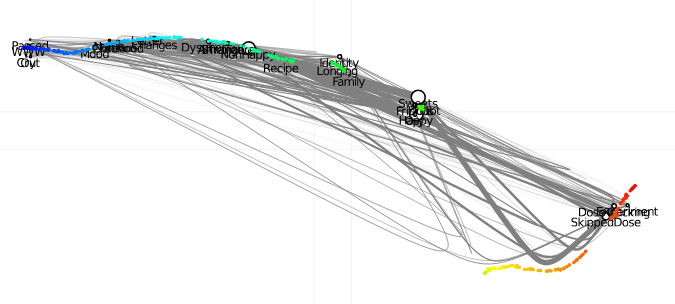
Here, time begins on the right, then smoothly curves down, then jumps upward with a sudden structural break, then continues to move leftward with the occasional smaller break. And whereas Figure 1 showed the axis that most discriminated time overall by placing Happy at the far end of time, Figure 3 places Passed, WWW, and Out at the end of the story instead. This does better represent how things happened: I started feeling better about myself enough to come out to new people, to engage with other trans people online, and that in turn helped me be happier more often. However, because Passed, WWW, and Out are relatively recent things, there is not as much data about them, so Happy wins out as the better linear discriminant in Figure 1.
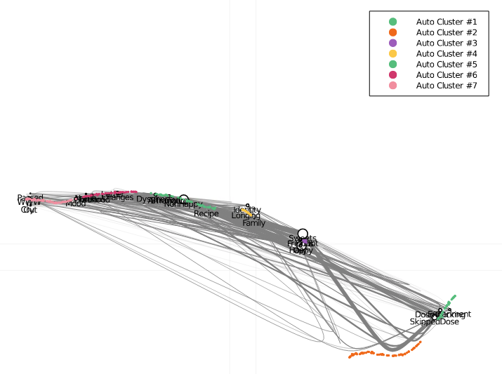
Further, those structural breaks along the way are strong enough that we can automatically detect, cluster, and label them. Figure 4 shows the result. These are the same labels used in Figure 1.
Okay, so the nonlinear projection appears to capture local information better and there appear to be structural breaks in the data. But, qualitatively, what do those breaks correspond to? Are they actually meaningful, or am I just throwing shrimp at the wall to see what sticks?
Update: Turns out this model was too eager to let time influence it. The model used in the paper had a more appropriate balance.
The breaks occur throughout March, the start of July, mid-August, early-to-mid September, late October/early November, and Christmas.
Throughout March, I doubted myself. I was anxious as hell, and being stuck in my house for the pandemic didn't help. During this time, I started, stopped, and restarted taking my HRT doses a number of times. Then, in late May, my hormone specialist retired, the summer was starting, and if I were to continue taking my hormones I would soon run out and be unable to refill them until the start of the next semester. So, I bit the bullet, and I did a lot of reflecting that summer.
Come July, I had enough of my original prescription left over to start HRT again in earnest. I reached out to a new specialist, we spoke over Zoom, and I set a goal for the semester: Stability. I wanted to stop worrying about my prescription so much, stop tracking things in every unhelpful minute detail, and just live my damn life.
Then on August 16th I prayed.
I asked God to grant me clarity and courage. This wasn't the only time that I prayed during the past year, but it was the only time I wrote about it. I had prayed so hard that I cried, and it was during this that the name "Mariah" came to me. For years I had been thinking about what my name would be if I transitioned. None of them stuck. But this one did.
Sometime after that, in the first week or two of September, I met with my specialist again, and I talked about how going to get my prescriptions refilled was making me so anxious. Every time I had stopped taking my hormones early in the story, it was in the days leading up to when I was imagining going to CVS again. Nothing bad has ever happened to me at CVS. But try to convince my anxious brain of that! Hearing this, she changed my prescription from a one-month supply to a three-month supply. It was this, more than anything else, that allowed me to just live my damn life last semester and find that stability.
As time went on, I got used to being in my house all the time. One accident of this was that I ran out of soda and stopped drinking caffeine for so long that I stopped craving it altogether. In Figure 1 there is a thick connection between NonHappy and Sweets: These were my anxious days, and when I was anxious, I would crave a Redbull, which of course only made me more anxious. I've started drinking La Croix instead, and my anxiety has never been so managable.
Around that same time, because of the stability I had found from moving to three-month prescriptions, I was able to turn my attention to actually feeling pride about myself. I bought a braided leather bracelet in the trans pride colors, and I wore this every day as a reminder that it's okay to be myself and that, if folks find out, well, that's okay.
Finally, on Christmas I came out to one of my friends here in Madison. And since then I've been gradually and increasingly coming out to more and more folks around me. Being in the closet had been so exhausting.
While I'm not out generally yet, Update: yes I am, I'm so happy with where I am and how far I've come this past year. I'm out to my advisor, my fellow graduate students in the UW iSchool, the faculty and staff at the iSchool, a handful of my students, all the members of the Epistemic Analytics Lab, and the whole QE community. I even presented at ICQE 2020 under my new name!
While I'm still going to keep notes on my experiences from time to time, I don't want to do so like I've done this past year. There's a time for rigorous self-reflection, and through this I feel I've been able to go a long way towards my first goal I set with my first hormone specialist: Understanding. But it's time now to live my damn life.
As for the nonlinear projections of ENA data, it needs a lot of work. The plots are illegible. UMAP and DBSCAN each introduce a number of hyperparameters, which we try to avoid in QE if at all possible. When w1 is too high (like in Figure 3), the placement of the codes in the plot sometimes gets strange. And making any use of these plots just...ain't that systematic. Yet. For now it feels a lot like using a Ouija board.
I have some ideas for how I might move these ideas forward. As in any grounded exploratory work, it involves re-grounding the story being told by the plot back in the original qualitative data; offering an explaination for why those structural breaks might have occured; and re-coding the data to make the attributes of the break explicit, projectable, and systematic.
Beyond that? I don't know for sure.
But I'm not worried.
And there's plenty of time.
It's going to be okay. Update: This was a link to a good Tiktok, it doesn't work now, but trust me.